Strange Animals 28feb2020: Left of Reality
I’ve been gone a few weeks, plus I realised we were due a wee station ident anyway, so here we go:
I’m Aditya Bidikar, and in the main, I letter comic books. You might’ve seen my work in books like Little Bird, Hellblazer, Isola, These Savage Shores, The White Trees and quite a few more. I’ve lettered a few thousand pages of comics by now – you’re bound to have run into one of them. You can find examples here.
Apart from that, in a previous life, I have edited comics, and written comics as well as prose. The most prominent examples of the latter would probably be the three short stories I wrote for the Doctor Who spin-off universes of Faction Paradox and Iris Wildthyme. I’ve recently started writing fiction again, and you’ll probably hear more about that as we go on.
This newsletter usually consists of an essay on comics/writing/films/whatever, along with some other tidbits. Feel free to forward it to whoever you think might be interested.
1. Notes
The previous edition was a truncated one, because I was going through a rough patch. That continued, sadly, but I must say I was pretty productive throughout, apart from the newsletter falling by the wayside – I rewrote 20 pages of SAWBONES, wrote a 6-page comic which is now with an artist, and rewrote half a short story.
I have a feeling I might need to pick up a couple of lettering assignments just to keep myself busy, though – I have found that it’s easier to stick to a routine when your day is full, and a short day can actually make you less productive even though theoretically you have more time. We’ll see about that.
The short comic I mentioned is intended to be part of an anthology I’m slowly putting together. I’ve written drafts of four scripts, but this was the first one I felt was good enough to actually go to production. The idea is to write 12 scripts, and produce the best 6-8 and to junk the rest. You’ll probably hear more about this later in the year.
Also, I have a long spotlight essay on Todd Klein in the latest PanelxPanel, out now. I often forget to note these here, since they’re not part of the job, per se, but they’re a ton of fun to do, and I’m very proud of them. I’ve done four so far – on John Workman, Jack Morelli, Tom Orzechowski and now Klein – and I’ll be doing two more before closing out the series.
For Klein, I chose The Sandman: Overture, because I think it showcases most of his best attributes, and it allowed me to talk about the highlights of his career. My original choice was The League of Extraordinary Gentlemen: Tempest, but turned out I had little to say about his work in that other than going “whoa” a lot, so I changed tack. Hope you like it!
2. No Use, All’s Lost
A little while ago, I did a Twitter thread on Dave Gibbons’s lettering in Watchmen. I wanted to put it all together in one place, along with addenda sent in by other users.
I feel that while Watchmen is duly acclaimed, we don’t give enough credit to Gibbons for what he’s adding to the book as a letterer, so here are some things I noticed he was doing with the lettering.
(Content warning: Some of the images depict violence against women.)
For reference, below this, you can see the “normal” lettering style of the book – Dave Gibbons’s default hand-lettering, with balloons drawn with quick, angled strokes. Further (not seen here), only the tails actually break the panel borders. The balloons themselves are butted against them.
There are two exceptions to the norm, and that’s Doctor Manhattan, and Rorschach.
Doctor Manhattan gets his trademark blue balloons after his transformation:

And Rorschach gets italics with a roughened-up balloon when he’s in costume, plus his trademarked journal lettering with the lowercase ‘a’s and ‘e’s and spots of ink/dirt:

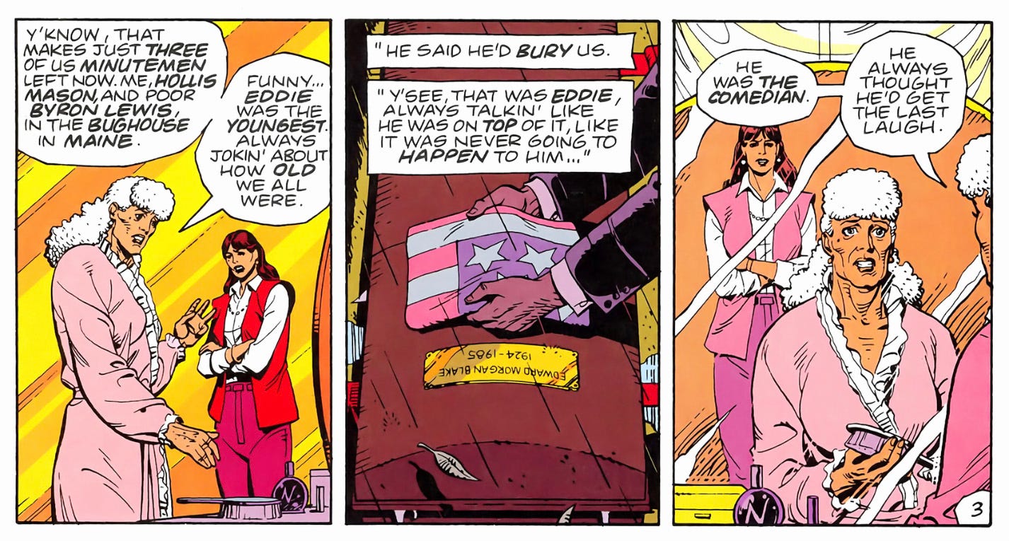
But, having established the normal style, when the narrative shifts to the 1940s, for the Minutemen sections, Gibbons shifts to using more retro-looking scalloped balloons. It’s a subtle but effective indicator of a simpler, brighter time (which turns out to be nothing of the sort).
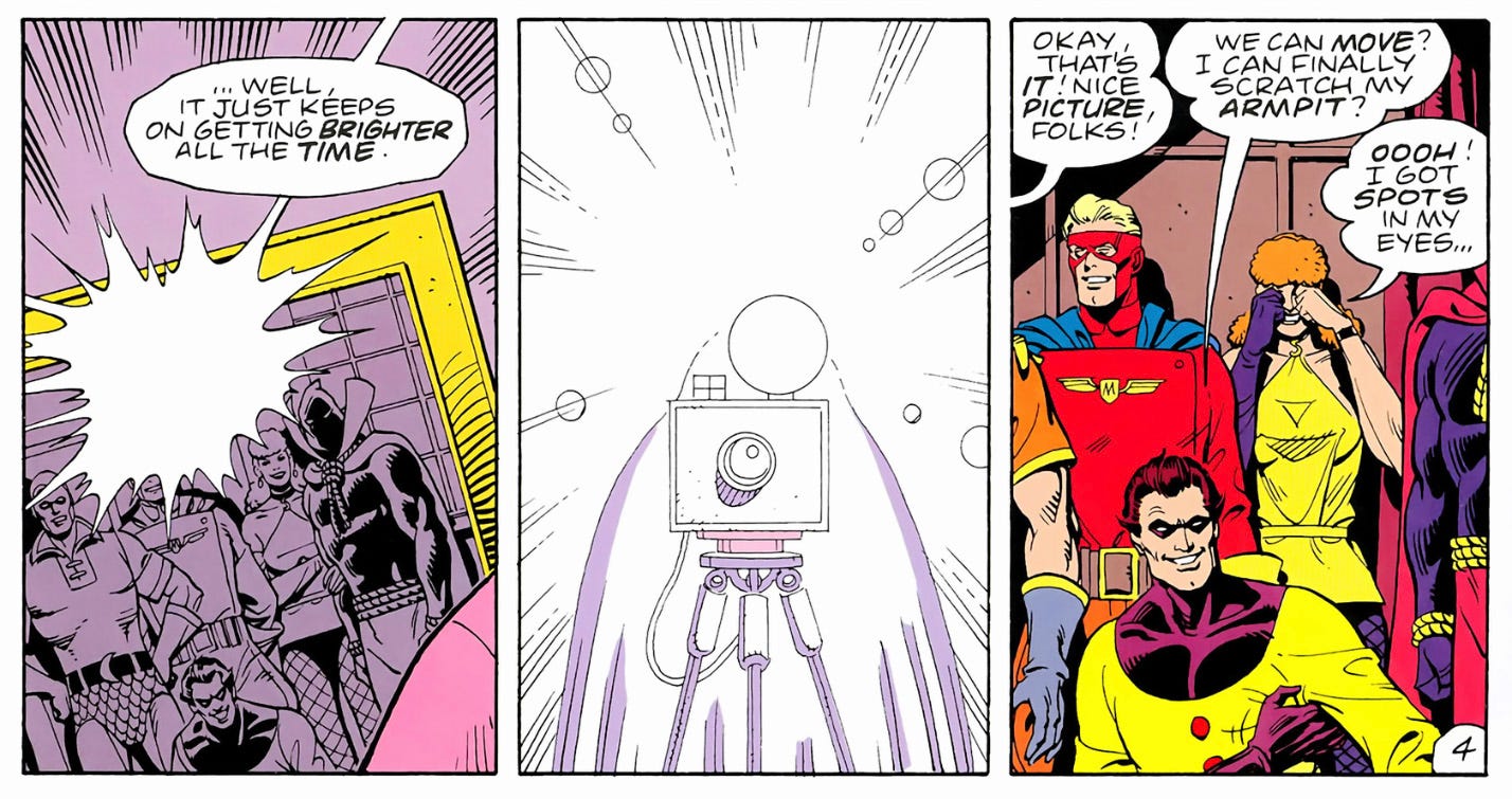
The same trick is repeated later for the 1940s sections of the Doctor Manhattan narrative, for obvious reasons:
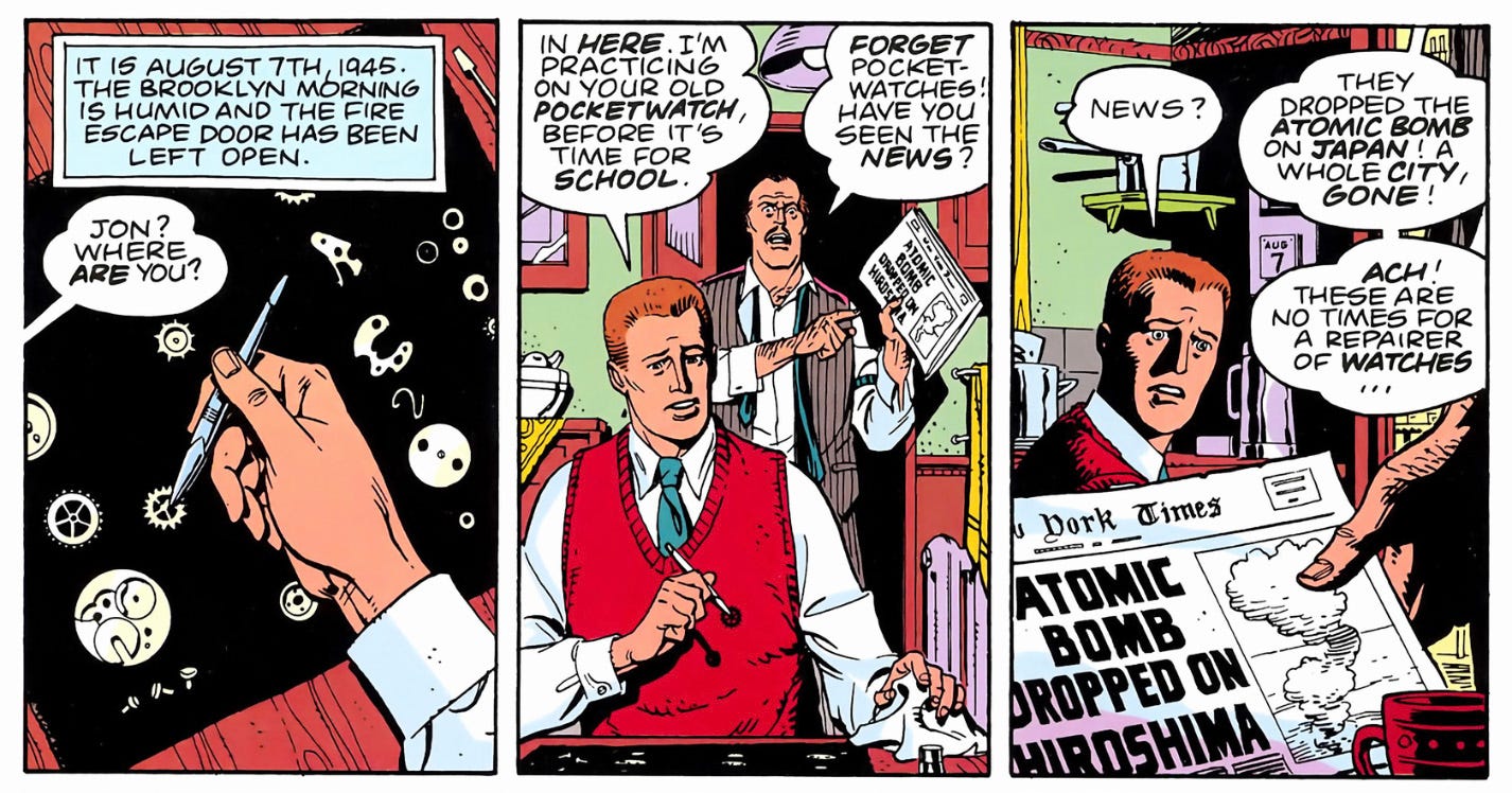
Then when the narrative shifts to the 1960s for the “new Minutemen”/Crimebusters, Gibbons shifts to drawing more traditional round balloons, stylistically splitting the difference between the 40s and 80s sections.
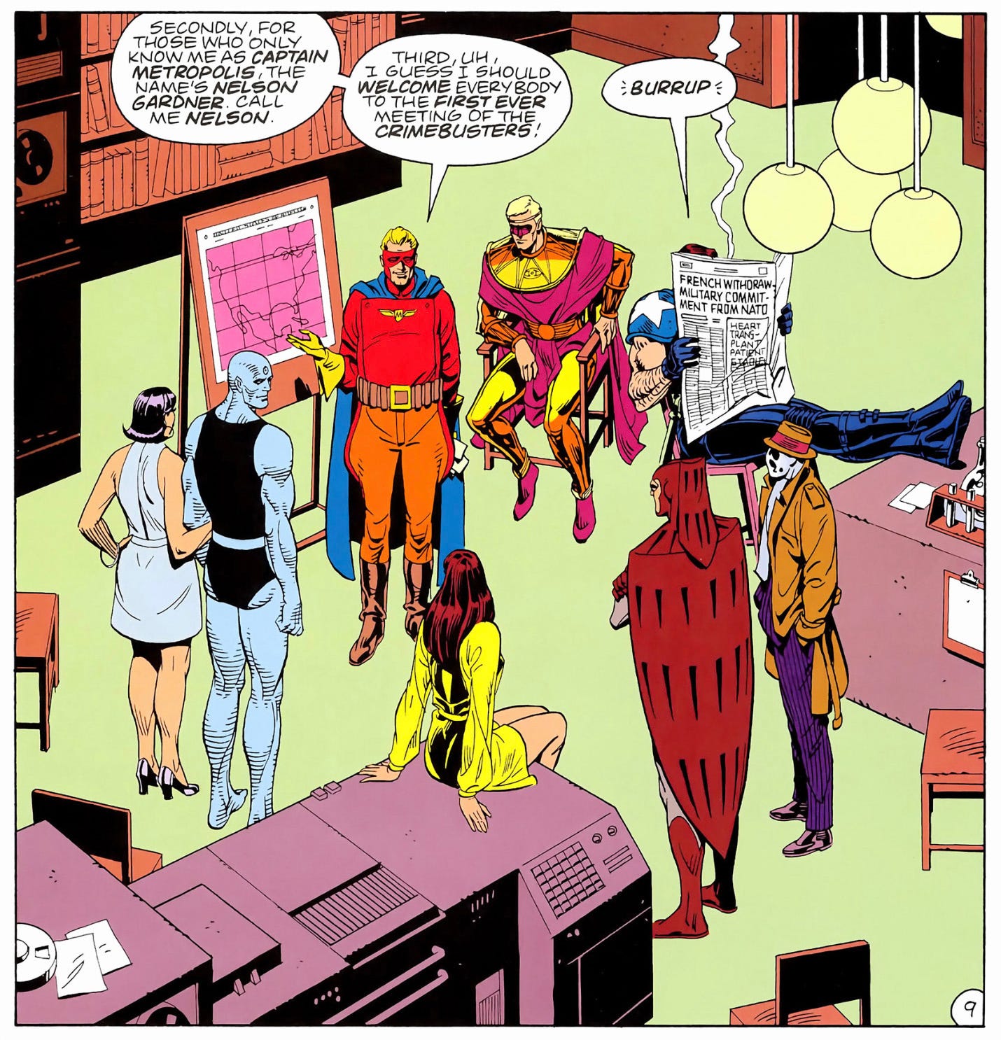
And once again, we see that Doctor Manhattan’s sixties segment also has rounded balloons, creating a visual match.
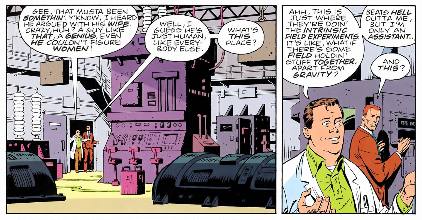
The little Tijuana Bible based on Sally Jupiter gets its own individual lettering style even though it appears only for a panel, and this time it gets its own font too, and both are inspired by actual Tijuana Bible lettering styles.

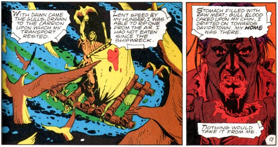
This one goes last, since it’s likely a John Higgins trick rather than a Gibbons one, but the torn-parchment captions of the Black Freighter narrative, with calligraphic initial caps, are coloured with halftone dots to distinguish it from the clean colours used for “real life”.

After I posted the thread, Andrew Hickey pointed out that last one was likely something Higgins did while recolouring the book in the 2000s, and Iain Coleman confirmed that in previous editions, those captions have the same white background as the rest of the balloons:
Brion Salazar also pointed out that Rorschach’s lettering is different in and out of the mask (when he’s Kovacs), and Patrick H. noticed that his balloons from the 60s aren’t rough like the ones from the 80s, showing us the transformation from Kovacs “pretending to be” Rorschach to Rorschach taking over fully.

If any reader has noticed something that I have not pointed out, please feel free to write in.
3. Recommended Reading
The posters for the upcoming Amazon series Tales from the Loop just dropped, based on the tabletop RPG that Simon Stålenhag provided art for, so I thought I’d recommend The Electric State, one of Stålenhag’s best “narrative art” books.
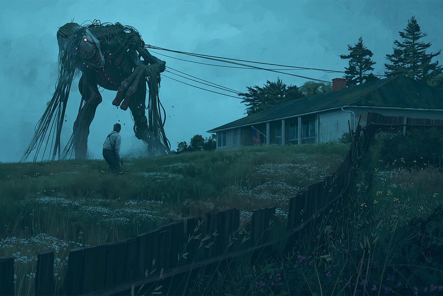
There’s not much to the narrative, about a girl and her robot on a road trip through a post-apocalyptic world, but it’s well-designed, and the centrepiece, through and through, is Stålenhag’s art, beautifully rendering a world just left of reality, but only by accident. Stålenhag’s work constantly makes me feel like these strange beings and behemoths that he draws could come to life today – an oddly fitting feeling to have as the world gets more surreal around us.
4. From the Commonplace Book
Let’s stick with Watchmen-related stuff, shall we? I’ve been re-reading some of my Alan Moore entries, because I’ve been writing comic scripts, and, over time, he’s spoken fairly lucidly about the process. Here’s Moore in a “lost” interview, talking about how he creates characters:
I believe that each human being has got the potential of every other imaginable human being inside themselves. If you can just plug into that, you can just pick out one piece of the jigsaw, expand that, and turn it into a character.
He offers an example:
You know, writing Etrigan was an incredible experience. Getting into the character was incredibly difficult – he’s so heavy. His thoughts are so dense and sort of massive and ugly. I had to think of how his body would feel. He’s sort of short and stocky, but I feel that his body probably weighs a couple of tons. I figure that his body is just so dense that he crouches. So I was just standing in front of the mirror hunching my body up and walking around, trying to feel the power of it. I was thinking, “Well, he’s got these teeth in the front and he’s got this cleft lip … so how’s he going to talk? It would deform his speech.”
I tried to talk around my teeth like this … (he demonstrates) … and eventually, the voice I got was an electronically-distorted Charles Laughton as Captain Bly in Mutiny on the Bounty. That sounded just right for Etrigan – sort of heavier and more guttural with a slight speech impediment.
Once I’ve gotten the speech and the feel of the body, it’s very easy to write the dialogue. I start to feel like I’m inside the character. It’s a very psychotic way of working. I wouldn’t advise anyone to take it up, but it’s very effective.
Filed under #comics and #writing.

