Hello! It’s been a while, hasn’t it? And I was doing so well too – I’d managed more or less a post every week. But then I fell ill for a bit, after which my health issues have continued – all aftereffects from last year – and I’m now on a new diet and exercise regimen that’ll hopefully help me get back to fighting form.
///
A lot of books came out since the last time I wrote to you, so I won’t recount all of them here. But I’ll just remind you that I’m currently lettering Swamp Thing and Detective Comics for DC, Home Sick Pilots and The Department of Truth for Image, and The Picture of Everything Else and Giga for Vault, plus a smattering of short comics for various publishers.
That slate reflects just how much I’ve cut down on my work. I think till around last year, it was normal for me to be on ten ongoings/mini-series (apart from OGNs and short comics). This is very much a good thing. I’ve been working on my health, and I’ve finally amped up my work on fonts, as I’ve been meaning to for a few years, and crucially, you’re not staring down deadlines with those, so it’s a lot more relaxing as work goes.
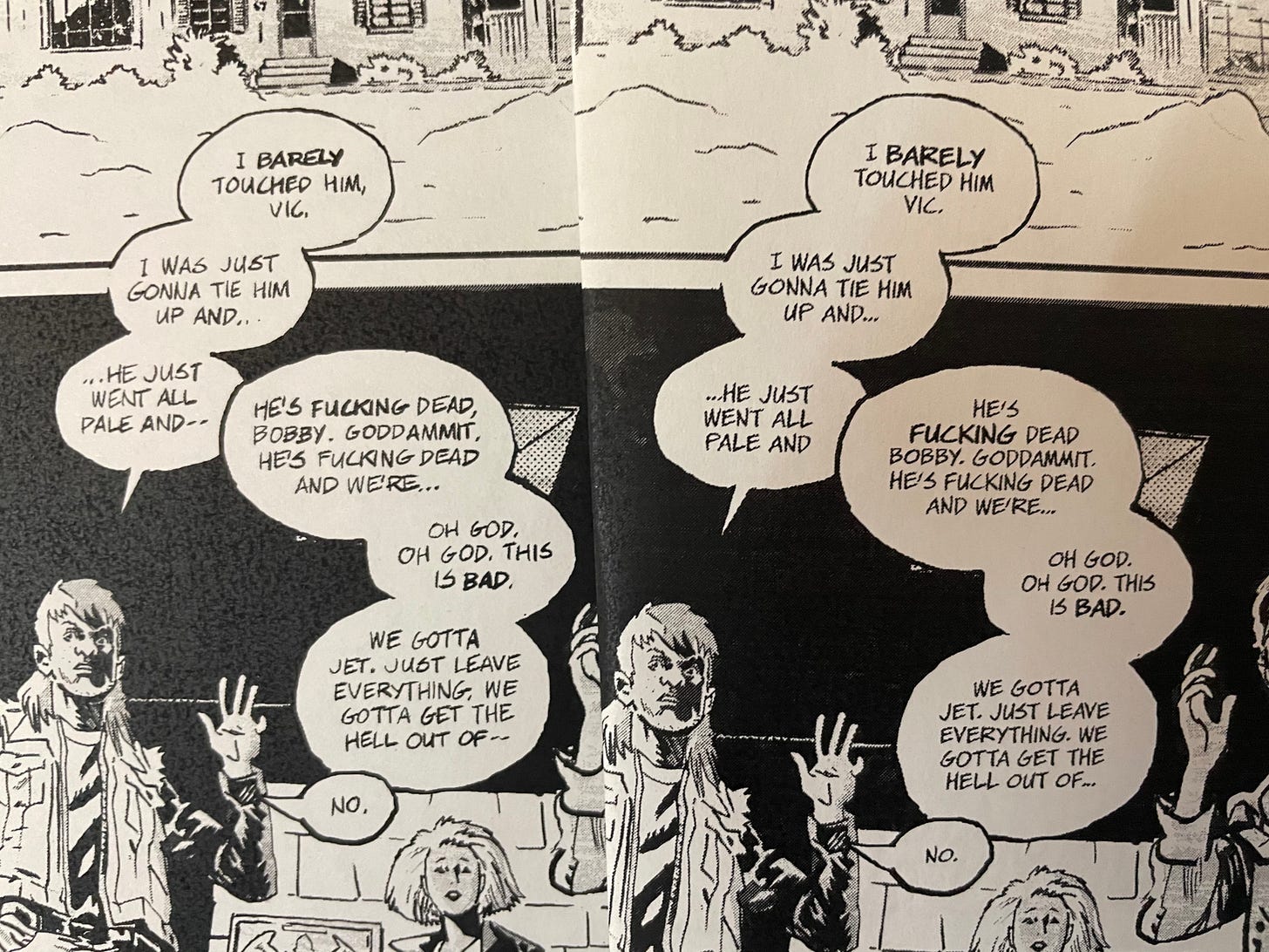
Speaking of font design, I’ve almost wrapped up Michael Walsh’s font. He has a playtest version that he’s checking out, while I’m putting the finishing touches on the italic, bold and bold italic weights.
Here’s what it looks like. The page on the left is Michael’s actual hand-lettering, and the font is on the right.
I’ve also managed to figure out how to code in the “auto-crossbar”-I, which’ll automatically make sure that the crossbar-I is only applied to personal pronouns. Here’s what it looks like in action.
I also really enjoy adding in multiple punctuation marks to make my fonts more “comics-y”. You can check that out here.
Finally, let me get personal about lettering for a moment. I haven’t talked much in public about how I feel about my craft. It’s definitely not just a way to make a buck for me. I really love the intricacies of comic-book lettering, and I like figuring out new solutions for both new and old problems.
Nevertheless, within comics, it’s a peripheral discipline. You depend on other people and the work they’re doing to put your skills on show. I can’t show you a snazzy new lettering trick if the script doesn’t demand it. I’m the rhythm section – you can have a fantastic bassist, but a shit song would still be shit with a great bass. Thankfully I’ve been very lucky with my collaborators, and very often I get to put on a show, but it’s their work that’s the primary draw, and I’ve always been aware of it.
In fact, I like it. I didn’t go into comics craving glory. I like the fact that a book doesn’t live or die by my work, because it means that when I sit down to work everyday, all I’m concerned with is doing the best I can – I don’t have to worry about audience response or sales. In fact, my biggest audience is my team – those are the people I’m trying to please, surprise and delight.
So it always makes my day when I do get a compliment, and even more than that, I’m taken aback when someone writes about my work. That someone felt like putting in effort and creating something about my my work. And I’ve been lucky enough to have some great writing done about my work.
Ritesh Babu is one of the smartest comics critics writing at the moment, and you can imagine how flattered I was when Comics Bookcase published a 5000-word piece by Ritesh analysing my work in Blood Moon, Coffin Bound and The Department of Truth, and how they relate with one another. Even apart from this being about my work, I think this piece is well worth a read for how it looks at the things lettering can add to a piece.
Frankly, it’s something I’m going to keep coming back to when things feel a bit pointless, as they occasionally can. If sometimes I feel like I’m not adding value in this industry, I can read this and know that at least for some, I am.
///
Let’s leave it at that for today. I’ll have a full-fledged version for you next week, but for now, I just wanted to say hi.


Thanks for saying 'hi'. This was a fantastic read and I really appreciate your work in all of these titles. HSP was something I wasn't sure about, but the color and letter work really sealed the deal on that one. Love DoT and the flavor of the lettering adds to the vibe and environment. In GIGA you went with a lettering style I'm not usually a fan of, but it really shows your talent for picking something that works within the composition. Keep up the awesome work and best of luck with your health!