///
It’s a quick one this time. I’ve got a main essay and an update, but nothing else for you. Fortunately, the new format means I can actually do this. So in your face, Past Me.
///
New this week in books I lettered:
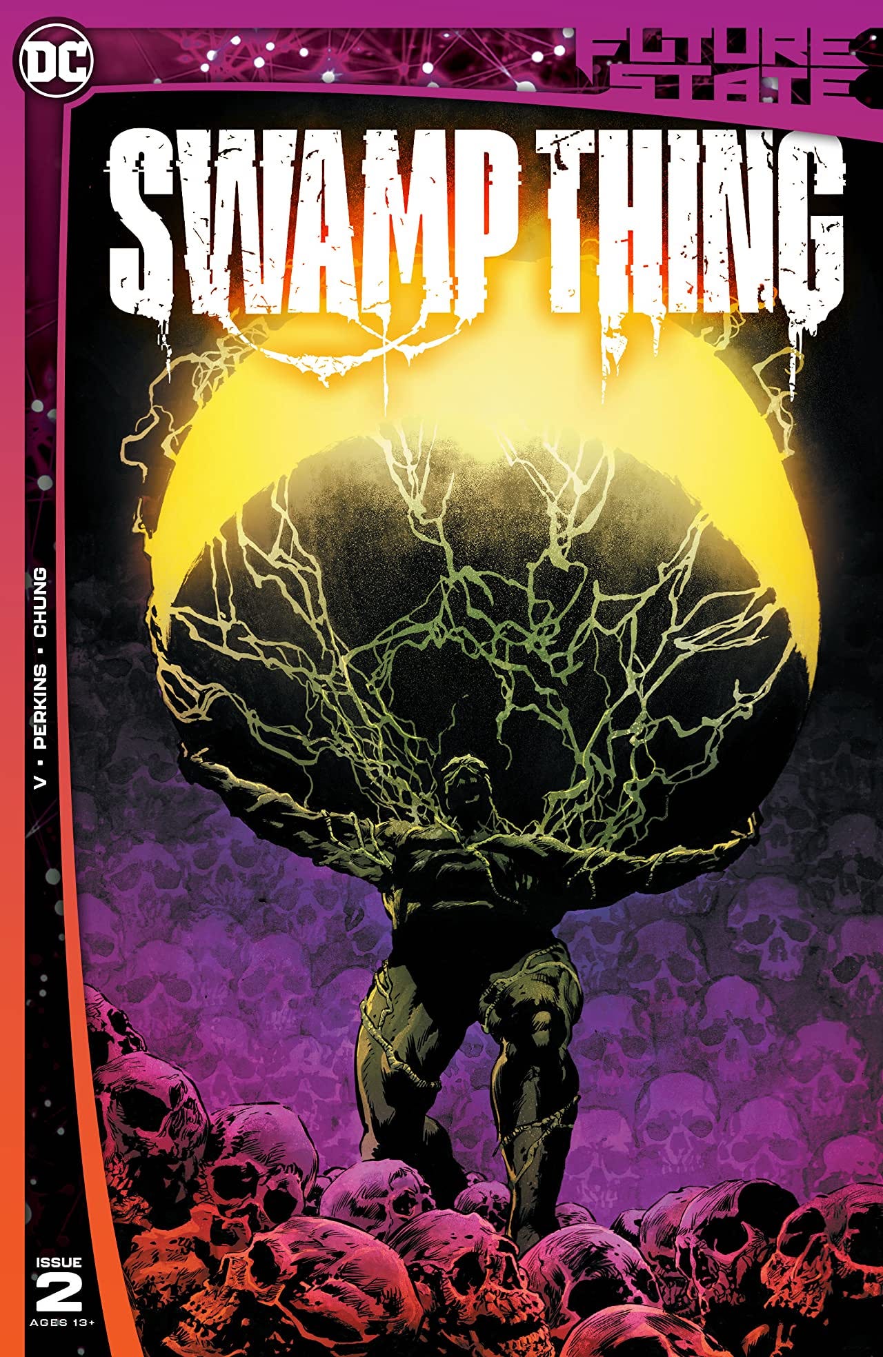
Future State: Swamp Thing #2, written by Ram V, art by Mike Perkins, colours by June Chung, edited by Alex Carr and Marquis Draper, from DC Comics.
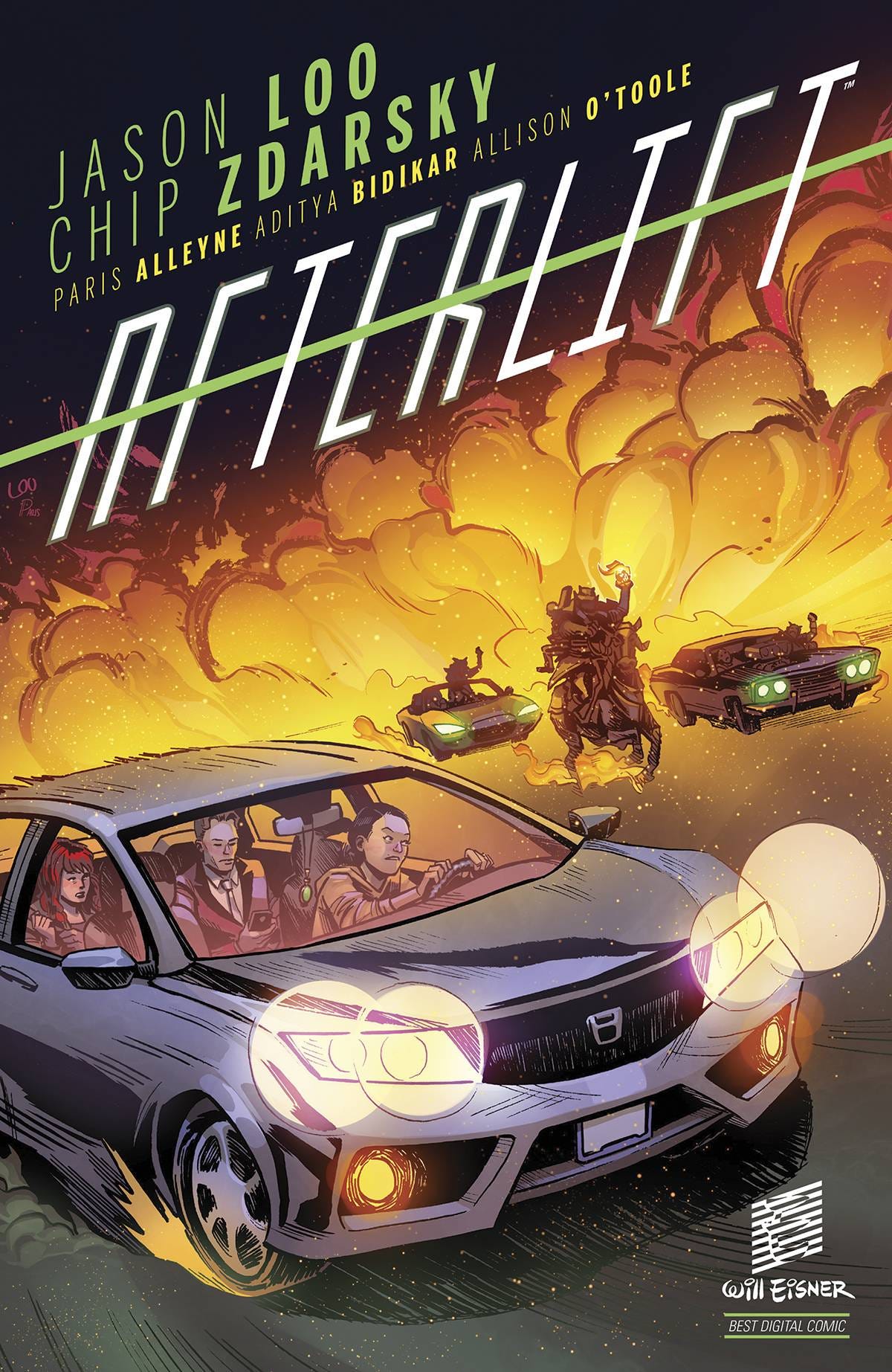
Afterlift came out in print from Dark Horse. It won the Eisner for best digital comic last year as a ComiXology Original. Now you can hold it in your hands. Written by Chip Zdarsky, drawn by Jason Loo, with colours by Paris Alleyne, and edited by Allison O’Toole.
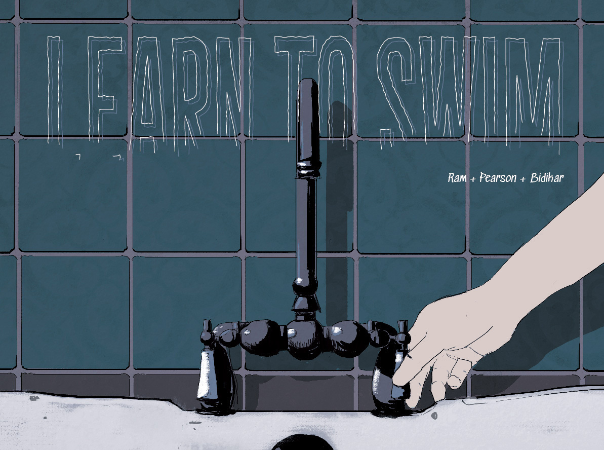
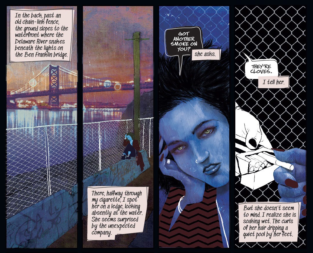
Razorblades #3 released this week too, and I lettered Ram V and John Pearson’s “Learn to Swim” for this edition (first page up top), and got to try some very interesting lettering stuff.
///
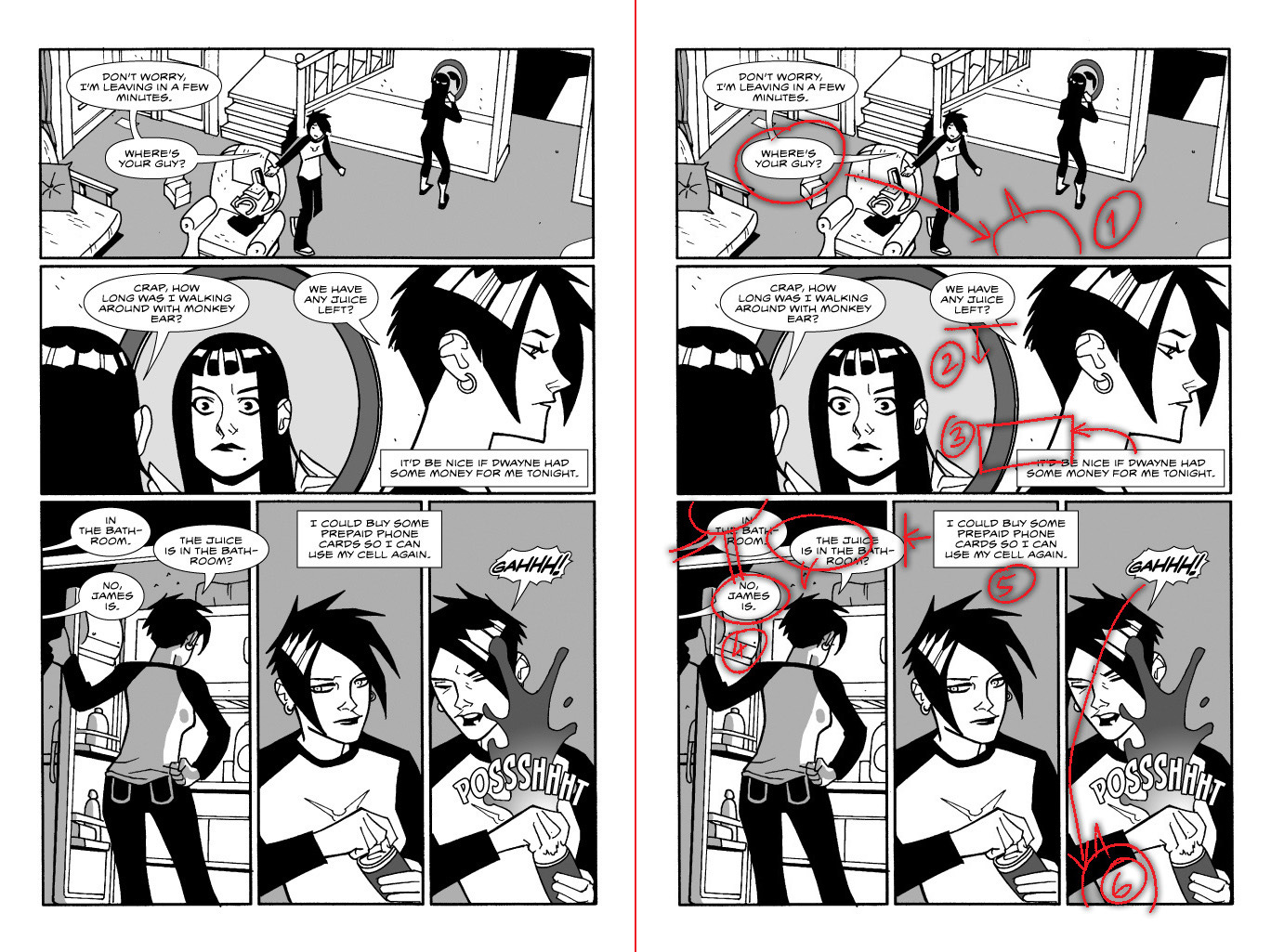
Last week, my former colleague and excellent editor/writer Ashwin Pande sent over a ten-year-old portfolio that I sent him before I started working with Graphic India. I posted it online, with a sigh of relief that I’d come a long way since then. Some people asked what I felt was so lacking in the portfolio, and I figured it’d be interesting to do a draw-over critique of my own ten-year-old work.
First of all, I’m pleased to say I’m not entirely embarrassed by it like I would be if we were talking about the very first pages I lettered. Mostly, this work is professional, but it’s lacklustre, and could use revision. Like I said, I had a long way to go. Let’s do two pages as examples.
First, the good. The font choice is absolutely fine – but David had already lettered issue #1 with that font, so that wasn’t really a choice I made. The balloon style is basic but functional. Doesn’t look off, though it could be just slightly thicker to match the font.
1) The current version is fine, but if the second balloon were moved, it would pull the eye across the panel, particularly to the girl looking in the mirror.
2) This is not okay. The second balloon should be lower than the first, so there’s no confusion in which order to read them in (which would become even more relevant if note 1 is executed).
3) Okay as-is (I know a few letterers who try and always push captions to the edges of panels), but it looks weird the way it cuts off the character’s neck, which can be fixed.
4) This is the big problem on this page. I don’t know why I was reluctant to butt the first balloon against the border, but there’s no reason for balloon 2 here to be outside the panel, especially since you’re supposed to read that and then travel back left for balloon 3. Also, balloon 3 is not really monumental enough to need a separate tail. The fixed positioning would let you read the balloons properly.
5) If we move the previous balloon, there’s more than enough space to move this into the second-last panel, which would let the last panel’s action stand by itself rather than making it feel static.
6) The SFX is clearly happening before the scream, but is represented after. I vaguely remember agonising about this, but the “GAH!” would be just fine coming at the bottom of the panel. Finally, I’d definitely render both the burst balloon and the SFX much better now.
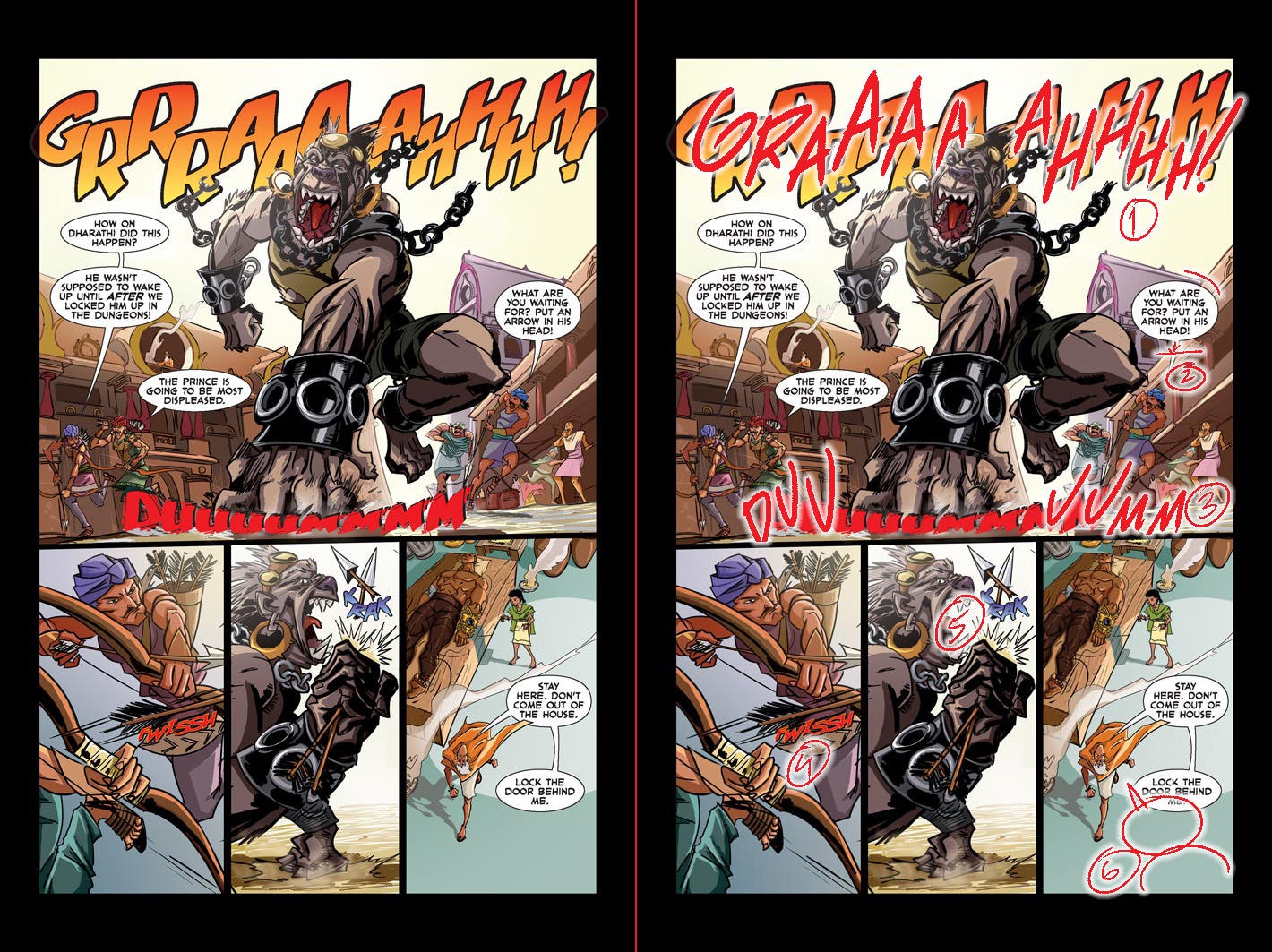
First, the basics. That font choice is just not right for the tone of this story or the art. Clearly, I’d just purchased the font (Blambot’s CloudSplitter – it’s a good one) and was enamoured by it and wanted to use it in the next thing I did. You see this a lot – designers and letterers always want to use the fancy new tool, sometimes without thinking deeply about whether it works in that particular instance. Here, it does not. (Full disclosure: This was literally the first pro font I’d purchased – I’d always used free fonts before this – and that is exactly why I used it here.)
The font is playful and modern, and feels like it’d fit either a comedy book or some sort of SF story. This story needs something a little more sombre and clean, probably something like CC’s Meanwhile.
The balloon style is adequate, but nothing to write home about. Now to the specifics:
1) The choice of SFX font is alright, and I like the effort taken to mask it behind the ape – and it’s good masking too, though ideally the second A would show through the earring, or be positioned such that the question doesn’t arise. The problem here is the way the letters bounce too evenly, in a tick-tock fashion. I’d be a lot more bouncy with them, and increase the size of some of those As. Though these days, I’d just draw the SFX whole-cloth.
I’m also happy with the colour choice here, but not so much with whatever’s going on with the black strokes – this doesn’t feel like it needs two stroke widths.
2) Tangent. I’d move it a bit lower to avoid it.
3) This is the big one here. Like … what the fuck is that? It’s barely readable, does not go with the colour scheme at all, and a font with “shaky bits” thrown out of the letters is probably the worst way to indicate the ground shaking. Just … nonsense.
First of all, a sound effect should feel like it’s part of the design of a panel. So you should be able to imagine the artist drawing it. And the strokeless border here is just the wrong way to go. This needs a black border to anchor it to the panel.
Next, the arc shape is a valiant newbie attempt at indicating the flow of the sound, but what I’d do now is move the SFX off the ape’s fist, ground it to the bottom of the panel, and have it be “DUU … UMM” separated by the ape’s fist, and angled backwards and forwards as drawn in the figure. Also, much taller and thinner – a thick sound isn’t always indicated by thick letters.
4) Same here – the strokeless method is just the wrong call. Needs a black stroke. But otherwise, surprisingly decent.
5) I actually love how that KRAK is drawn, but the colours are all wrong. I’ve clearly pulled them from the ape’s chains, and the sound just doesn’t pop. Red or orange would be better.
6) Okay, this is a clusterfuck. It’s trying to guide the eye via masking, but it’s neither necessary nor effective. One could charitably assume that the smoke might actually be drifting behind the old man, so it can go behind the balloon, but the tail that goes above the cloak that leads to a balloon that goes behind … I mean, since this is a top shot, it’s not technically breaking planes, but it very much looks like it does. And it’s just not necessary. Sure, it adds to the feeling of motion, which is probably why I did it, but the likely break in the reader’s reading is not worth it. Much better to stack it all at the bottom of the panel. Plus, it’s not like they’re two distinct thoughts, so we can do without a connector.
Overall, I don’t think this is embarrassing work. But I’d definitely not do it like this today. Past Me had a lot to learn.
///
This week’s reading:
Tardis Eruditorum Volum 7 – Elizabeth Sandifer: I’ve been in a bit of a Doctor Who mood, so I tore through this. I read most of these essays when they were serialised, but it’s a pretty great experience to read them in one go – it gave me a real sense of the Virgin New Adventures, and I managed to compile a reading list. (I’ve only read five of them before this, and needed one.) The new-to-this-book Kate Orman interview is quite excellent.
Spam Kings – Brian McWilliams: Entertainingly written profile of spammers and anti-spammers involved in the early internet spam wars. Often reads like a Carl Hiaasen novel, given the peculiarly American subject, with pornographers, neo-Nazis and penis enlargement pills all vying for space.
///
Where the hell does the week go? Every time I send one of these out, I tell myself I’ll send the next one midweek and aim for that every time and yet, now it’s Sunday night, and I’m a day later than I was last time, even though I knew exactly what was going into this edition. Let’s see if I can land the next one in the coming week.
