Strange Animals 10jan2020: The Captain Lazypants Newsletter
Eleven days into the year and I’m already behind by two weeks. How’s your year going? Hello.
Current Reading: Star.Ships: A Prehistory of the Spirits – Gordon White
1. Notes
I’ve started my font work for the year by remastering one of my existing typefaces – Sitting Duck.
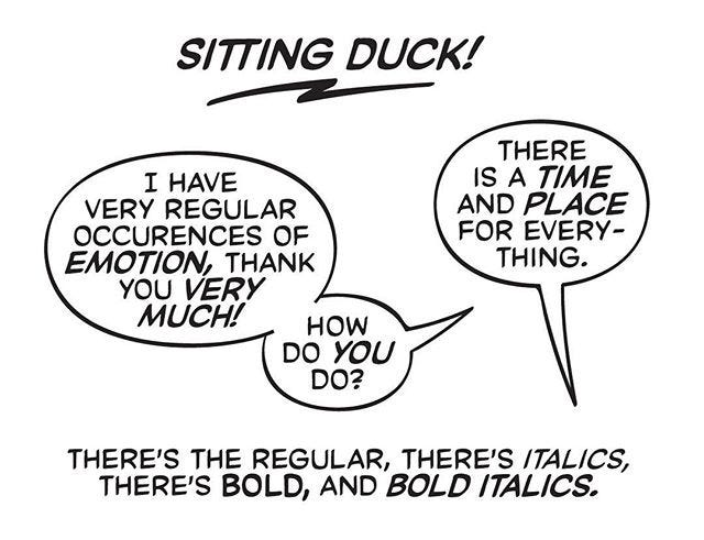
This was the first ever typeface I completed. Before this, I’d abandoned a few font ideas after constructing the letters in Illustrator, or tried cobbling something for a specific book but failed.
Sitting Duck was the first one that had a full character set, and regular, italic, bold and bold italic fonts. The original design for it was a bit more eccentric, but as I started turning those shapes into an actual typeface, I realised I had a lot to learn before I could experiment, so I simplified and cleaned it up to make it as generic and clean as possible without removing all the personality from it.
I think the letterforms hold up reasonably well, more than three years on, which is surprising to me, because I was just beginning my hand-lettering education at the time. The metrics and kerning, though, are a complete mess, as are the autoligatures. Looking at the font files, I could see how I’d slowly cobbled together a workable version over the years from a fairly ramshackle start. The italics (deep breath) didn’t even have an angle assigned in the font file, so all my metrics were eyeballed.
Right now, I’ve mostly finished the metrics for the regular and the bold (which were independently developed, with slightly different pen strokes, rather than one being generated from the other) and once I do print tests for overall size and spacing, I’ll kern them and generate the italics.
After that, I want to remaster my other already-complete font Mighty Mouse, because it has many of the same problems (and also has a slightly-too-reedy bold that needs to be beefed up), and now that I have a handle on contextual alternates, I feel like it could really use a third set of letters to cycle through automatically, so it’ll have more of an organic feel. I hope to finish both of these by the end of January, so I can then get to work on the six fonts I actually want to create this year.
2. Q&A
I solicited questions to be answered for this newsletter (a cunning ploy to try and get this out weekly if possible), and I got quite a few, so I’m going to split my answers between this edition and the next.
Why are some words in comics shown in “bold” text? Is it to put emphasis or something random to break the visual pattern? Thank you!
First of all, thanks for a question that allows me to interrogate some of the basic assumptions of comic-book lettering. This goes back to the history of type in general – italics and bolds are conventions that have evolved over time, and there were times in the evolution of type design when people have tried to take a different turn and figure out if there are different ways to show emphasis.
In comic-book lettering, the basic convention of upright lettering wasn’t established till quite late – you’ll see a lot of very early comics being lettered entirely in italics. It’s easy to imagine why this might be the case – when I started hand-lettering, I actually managed to create an adequate italic much quicker than upright letters.
So when it came to emphasis, bolds and underlines were your available options, because italics wouldn’t necessarily imply any sort of emphasis. Of these two, underlines are tricky, because they take up vertical space, so either you’d have set your leading loose for the whole of the text, or you’d make exceptions for lines that had emphases, and you’d end up with some unsightly gaps in your lettering. Bolds are easier, because you can keep the same start leading, and only change it up in special cases. Mostly, you’ll see underlines used at the end of a balloon, where there’s room to work with. There are exceptions, such as Adam Warren who uses a lot of underlines in his hand-lettering, but he also doesn’t really use uniform leading, so it works for his style.
To actually answer your question – it can be used both to show emphasis, and to break the visual pattern. Especially in older comics, intended for kids, there’d be a lot more bolds because you’d have to do more work to keep a kid’s attention. In comics intended for adults, it’s usually just for emphasis. But even in kids’ comics, it’s not actually random – you can read it out loud and you’d realise that the emphasis is either for rhythm or to point out the important bits to a particularly lazy kid who might just scan the words rather than read the whole thing.
As a reader, I’m able to recognize very bad lettering (e.g., the speech balloons are barely readable), but I don’t know what makes good lettering, except on very specific occasions like a DPS with a lot of things going on, where the captions guide my eye throughout the page.
Could you give us some pointers please? (This is prompted by all the “Best of 2019” lists I’ve seen these last weeks: I can make a list of my favorite writers, artists or colorists, but I’m drawing a blank when I try to do the same for letterers.)
A lot of these things are subjective, but I can tell you the parameters by which I judge both my own work and that of others.
The first is clarity – this is everything the letterer does to not mess with the intent of the other collaborators. The first of these is placements: your writer and artist want the reader to read the book a certain way – do you manage to maintain that order? Are you covering up anything important? Do readers have to stop and reread to understand the sequence of dialogue? Clarity also includes font selection and size – is the lettering too small or too big, is the body copy legible?
The next is competence – this is about whether the lettering is pleasant to read. This also includes font selection, but here you’re thinking about whether the font and the balloon styles feel suited to the artwork. This also includes the other stuff that letterers tend to learn over time – are the balloon tails consistent, are they pleasant to look at, is there the right amount of air in the balloons around the text, is the stacking (the line breaks in any balloon) shaped well and reasonably consistently?
The final parameter is expression – what the letterer is adding to the book that a different letterer might not. How well are they designing the sound effects and how integrated do those feel with the book? What active choices are they making other than simply presenting the writer’s words to the reader. This last part, to me, is what makes a letterer great, and that’ll vary both from reader to reader and from creative team to creative team.
A while ago, I made a video of myself lettering a page from These Savage Shores along with commentary on the choices I was making as I worked on it – you can check it out here. You can see a lot of what I talk about above being discussed/illustrated in this video.
3. Recommended Listening
I’ll probably write about my relationship with Terry Pratchett’s writing one of these days (or not – it’s a pretty personal thing, and I don’t know if it’d actually be of interest to anyone else).
Since his death, I haven’t actually read a Discworld book. I tried reading Raising Steam, but it was painful for multiple reasons, and I let go after a few chapters.
The new podcast Desert Island Discworld is allowing me to re-engage with his work slowly, by listening to other people talk about their relationship with it. It’s a thoroughly entertaining listen, but it’s also a moment of reflection on why, despite his flaws, Pratchett was such a tremendously interesting writer.
Depending on the guest, the podcast doesn’t shy away from pointing out the inadequacies of his engagement with certain topics, but fundamentally, these are all people who loved or enjoyed his work, and that’s the perspective this comes from. And since I’ve started listening to this, I am much closer to rereading his work than I was before.
4. From the Commonplace Book
Sarah Jaffe, writing about Trumpism in her newsletter:
Neoliberalism wants us to live always in the eternal now, to neither remember the past nor consider the future – the future is foreclosed, there is no alternative stretches in both directions. […] It’s the Shock Doctrine, as Klein told us years ago and demonstrates in her writing lately on Puerto Rico, designed to keep us reeling too much to resist.
Filed under #politics and #capitalism.